One of the most interesting things at the Malvern garden show is, for me the Chris Beardshaw mentoring scholarship competition. Eleven finalists were chosen to build their first show gardens at Malvern this year. The subject was ‘Atom’ to tie in with UNESCO’s international year of chemistry.
Whilst the individual gardens varied hugely, there were several themes running through most of the gardens. It is natural to consider the shape of the atom as one of the defining features, and many of the gardens had circles and spheres as motifs, to infer the shape of the atom. This was done in an interesting way in Becky Hand’s garden, with the box shape in the centre imitating the nucleus of an atom.
Detail from ‘The Atomic Journey’ by Becky Hand (Silver)
Several gardens took their inspiration from education and science. I thought that Lindsay Warwick’s garden was great fun, with bubbling water features which really shone out when the sun hit them, reminding us of what fun chemistry *should* have been when we were at school. Instead, it was rather more likely to involve producing slightly grey solids and setting fire to your fringe if you leant too far over the bunsen burner.


Rachel Phillips’ garden was designed as a place of learning and discovery, and packed a huge amount of detail into a small area. Again, there was reference to a central nucleus within the design – in this case a nucleus for gathering together to share knowledge. An inspiring garden, which I hope has a life after the show somewhere where young children can explore it.
Ladybird bird feeder
Detail from Rachel Phillips’ ‘Budding Scientist’ garden (silver-gilt), again reflecting the spheres used in many gardens
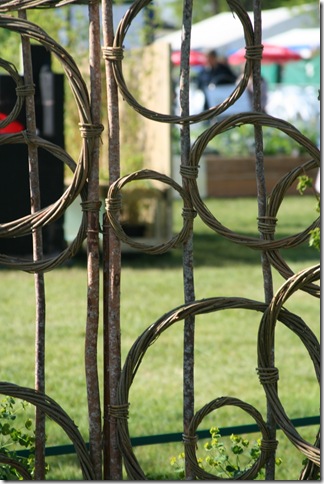
The mentorship scheme is sponsored by Bradstones, so one might expect strong hard landscaping in the gardens. I liked the long units used in the Po84 garden by Jackie Crofts, softened by herbs. Again, the circle motif was highlighted, this time using woven stems.

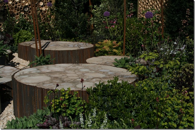
Two of the gardens could be described as ‘conceptual’. Paul Cantello’s garden really struck me, with (again…) circles coming to the fore. The garden was inspired by the oxygen atom and its need to pair with another of its kin to make a stable molecule. I think that gardens get called ‘conceptual’ when they aren’t obviously made for sitting in. But I think I *could* sit in Paul’s garden. The bamboo screens again echoed the circular nature of the podiums (for want of a better word), which themselves were paved with organic-looking hard landscape material. The rusty metal surrounding the podiums contrasted with the acid green of the euphorbia.
Paul Cantello’s ‘Breathe’ garden (silver-gilt)
The second ‘conceptual’ garden was that of Kasia Howard. An artist by vocation, Kasia’s garden certainly drew a lot of comment. The large cube was studded with hanging ‘baubles’ – spheres again. I can’t say I would want it as part of my garden, but that is not the point of it. Why have a show garden that merely mirrors a hundred thousand gardens up and down the country?
A couple of gardens which didn’t chime with me so well were Pippa Bumstead’s and Rhea Parkes’. Pippa’s was an exploration of the role of carbon in life, with plants used to recreate the feeling of oriental textiles. The planting was vibrantly, and I felt it lacked some height. It was an interesting interpretation of the concept of ‘Atom’, not least because it did not really include much of the symbolism that many of the other gardens did. I didn’t manage to take a decent photo, but the photo below gives an idea of the brightness of the planting, although rather out of focus.
‘Colour from Carbon’ by Pippa Bumstead (bronze)
Rhea Parkes’ garden used changes in level in the garden to represent the changes in the paths of electrons orbiting the nucleus. It also was designed to encourage sustainable use of water, though I’m not sure that I got this concept from looking at the garden. I felt that the hard landscaping rather dominated the garden, and it had an awkward angle in it. There wer some nice design touches – I liked the ‘insect hotels’ built into the walls, and some nice planting, with sun lovers exposed, and moisture lovers near the water feature.
‘The Rain Garden’ by Rhea Lyn Parkes (silver)
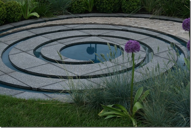
Another garden with a reliance on hard landscaping was Christopher Tessier’s garden. I rather liked this garden – an interesting water feature (if not entirely practical, but this is a show garden). Again, planted spheres highlighted the ‘atom’ design brief, with a limited planting scheme providing unity (although I think the mentorship judges thought the planting list a little too limited). The water feature was the real talking point; I liked the way that the feature integrated the two types of paving used in the design – the ‘cobbled’ paving swirling into the darker pavers.
‘Collision’ by Christopher Tessier (silver)
One of my favourite gardens for producing different views within the garden was Keni Lee’s garden, inspired by oriental gardens. The garden is symbolic of the trinity of proton, neutron and electron, according to Keni’s information. To me the subject of ‘Atom’ was not so explicit in this garden. The use of alpine plants in raised planters meant that Keni produced landscapes in miniature. I found this the most photogenic of the mentorship gardens, as you could frame different views through the moon gate. The finish to the planters let the garden down a little, although I hasten to add that I am in awe to all the first time show garden designers and couldn’t do it myself.
‘From Laozi to Heisenberg’ by Keni Lee (bronze)
The winner of the Chris Beardshaw Mentorship Scheme for 2011 was Caroline Butler. Like Keni’s, Caroline’s garden allowed different views into the garden, although I found it harder to photograph as there were no fences around it to provide a neutral background. The concept of atom was to the fore again in this garden; the positive aspects of the atom were represented by dry-loving plants, and the negative by moisture-loving plants. It was very nicely done, and an interesting garden, but it didn’t capture my imagination in the same way as some of the other gardens. The mentorship is judged against a whole range of criteria, and Caroline produced a great garden. I look forward to seeing her garden in the autumn, and next year at Chelsea.
‘In the Balance’ by Caroline Butler – winner of this year’s Chris Beardshaw Mentorship Scheme
Throughout most of the gardens, alliums were used extensively. I suppose there are two reasons for this – firstly their shape chimes nicely with the concept of the ‘atom’ – all of the individual florets circling the nucleus of flower stem, like crazy electrons clamouring around the nucleus. Secondly, of course, many of the gardens every year feature alliums at Malvern – it is their time. This is *a good thing* as far as I’m concerned, as it could be said that I’m rather keen on these flowers myself.
One reason why I was so interested in the interpretation of the concept of ‘atom’ was that I had put some thought into it myself. By no way am I skilled enough or imaginative enough to send in an entry, but reading about the competition last summer sparked an idea in my head. I thought of using the element magnesium as the basis of a design, as it is present in chlorophyll (the green pigment responsible for most photosynthesis in plants). However, the talented and imaginative people above took the plunge and actually *did* while I just *thought*, and took it no further. Congratulations to them all – each garden was a real achievement.


6 comments:
Thank you I was wondering who won and I am so glad it was my favourite which I havent posted about as my pictures didnt do it any justice. Those grass hanging basket things were most strange
Coming back later... looks a very interesting/inspiring post :-)
Those grass hanging basket things were not strange! I was very much involved with that garden and I feel it was most creative and inspiring - even if they aren't really a proper garden.
Hi PG, thanks for the comment. I did like your front on photo of the best in show garden - I didn't take that view, and was kicking myself afterwards.
Hi Shirl - you're welcome back any time!
Hi Anon - thanks for visiting. I think that strangeness, like beauty, can be in the eye of the beholder. Strangeness doesn't equate with either good or bad. In fact, a quick search online for a definition came up with: "1. Unusual or surprising in a way that is unsettling or hard to understand.
2. Not previously visited, seen, or encountered; unfamiliar or alien". Looking at those definitions, it seems that strange could be the ideal word. The garden, for many people at the show could be described very well as 'Unusual or surprising in a way that is unsettling or hard to understand'. That is one of the easons tht I was so intrigued by it, and enjoyed listening to peoples' comments. It was indeed most creative and inspiring, as you say, and I believe that Kasia Howard had that reflected, in the award that was given to her.
I'm sorry - I should value other people's commetns more. I think I associate 'strange' with bad, but maybe it can be good. Amazing show, anyway!
Anon :)
No need ot be sorry, Anon - when you work so closrley with something, it is natural to have such passion for it. It was indeed a good show. Thanks for the reply.
Post a Comment